Brief
To create a bold and inclusive identity that would prepare the city to welcome the Commonwealth Games — building civic pride, excitement and a sense of shared ownership across Birmingham.
The campaign needed to energise residents, celebrate the city’s diversity and position Birmingham as a confident, world-class host. It had to work across multiple touchpoints, from print and outdoor to digital and community activations, ensuring visibility across neighbourhoods and audiences.
Concept
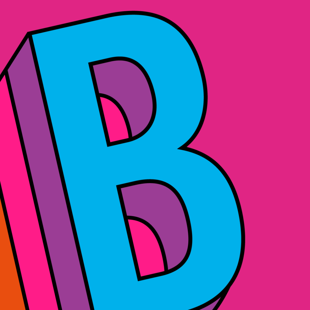
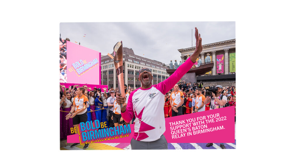
The creative direction drew inspiration from bold 1970s typography — particularly the dramatic, dimensional lettering seen in This Is Your Life and the dynamic pop visuals of The Jacksons. I was inspired by how letterforms in that era felt immersive and impactful — almost projecting out towards the audience.
From this reference point, I developed a strong, three-dimensional typographic approach centred around a single, powerful letter: B.
The B represented both Bold and Birmingham, directly aligning with the city’s wider “Be Bold” positioning. Designed to feel as though it was coming out towards the viewer, the letterform became a confident, forward-moving symbol — capturing energy, pride and anticipation.
The aim was to create something unapologetically bold and impossible to ignore — a visual device that embodied momentum and civic confidence.
The B quickly became a recognisable symbol in the lead-up to the 2022 Commonwealth Games and continued beyond the event, influencing subsequent branding for the council’s strategic priorities.

Visual Identity
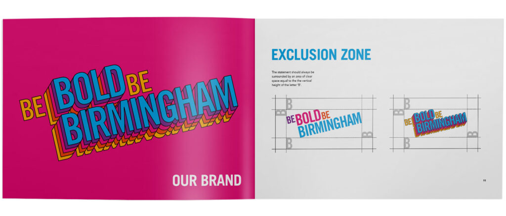
The dimensional lettering style became the foundation of the wider identity system. The bold, forward-facing typography was applied consistently across campaign materials, creating a strong and instantly recognisable visual language.
Brochure layouts and print collateral used a vibrant colour palette paired with thick black outlines, reinforcing the 70s-inspired aesthetic, while ensuring clarity and impact. The outlines helped the typography feel bold and confident across different formats.
This combination of bright colour, heavy black linework and dynamic composition created a distinct, energetic identity — one that felt celebratory, proud and unmistakably Birmingham.
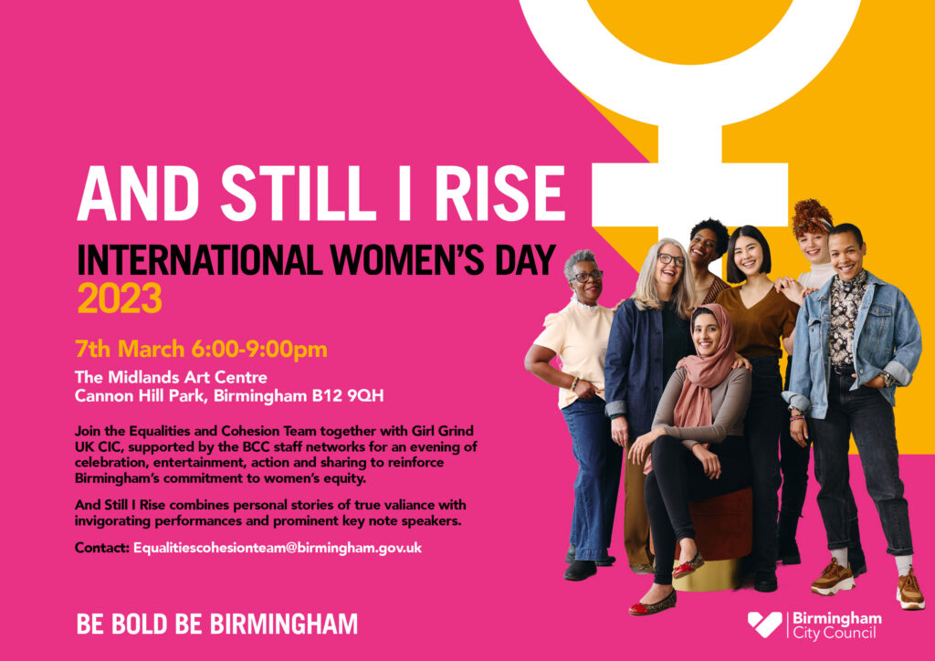
Flyer advertising an International Women’s Day event at the MAC (Midlands Art Centre) Birmingham